← BACK TO HOME
CASE STUDYDEPLOYED

Trident-Fitness

ProductROLE — PRODUCT BUILD

A gym's brand site with training programmes, plans and a landing page built to convert — the first paid client project, designed to feel like the room it represents.

TYPESCRIPTREACT
trident.raja-dev.me
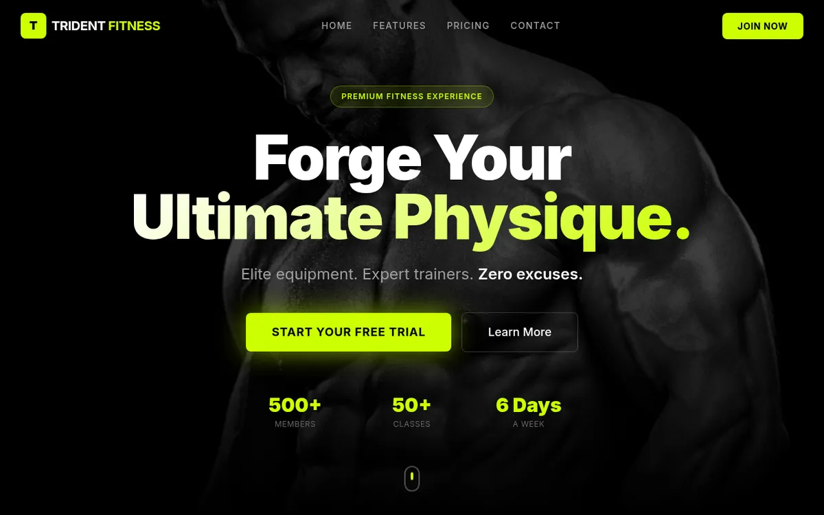
Trident-Fitness — live preview

THE PROBLEM

WHAT NEEDED SOLVING

The first paid client, and a brief that had almost nothing technical in it. The owner did not want a feature list — he wanted a site that felt like his gym. That is a genuinely harder requirement than a specification, because there is nothing to verify it against: a gym has a character built out of the room, the equipment, the kind of people who train there and how the place makes them feel, and the site had to carry that across to someone who has never walked in. A generic template with the logo dropped in would have satisfied every functional requirement and failed the actual one.

THE APPROACH

HOW IT WAS BUILT

The work went into design rather than architecture, which is where the difficulty was. Getting to a direction that matched the brand's feel — rather than one that merely looked competent — took the bulk of the effort, and the build stayed deliberately simple so that effort could go into the surface a visitor actually judges: a landing page with a clear line through it, training programmes and plans presented so a prospect can find the one that fits them, and a route to signing up that does not make them hunt. The client's verdict was that it came out ahead of what he had expected, which for a first commercial project was the outcome that mattered.

FIELD NOTES

PROBLEMS HIT — AND RESOLVED
  1. 01

    A BRIEF WITH NOTHING TO VERIFY AGAINST

    "Make it feel like my gym" cannot be checked off the way a feature can. The only way through it was to treat the client's reaction as the specification — proposing a direction, showing it, and reading which parts landed — rather than waiting for a brief precise enough to build from, which was never going to arrive. Design was the hard part of this project, and pretending otherwise would misrepresent it.

  2. 02

    DESIGN AS THE DELIVERABLE

    For a brand site the interface is not the packaging around the product, it is the product, and a visitor decides whether the gym looks worth their money in about a second. That inverts the usual priorities: complexity in the build buys nothing here, while typography, imagery and the order in which things are read buy everything. Keeping the implementation plain was a deliberate choice about where the effort belonged, not an absence of one.

CAPABILITIES

WHAT IT ACTUALLY DOES
  • First paid client project, delivered ahead of the client's expectations
  • Design direction derived from the gym's own character rather than a template
  • Training programmes and plans laid out so a prospect finds their fit quickly
  • Landing page structured around converting a visitor into a sign-up
  • Deliberately simple build, with the effort spent on the surface a visitor judges